Sunday, June 30, 2013

Final Design Project

Here are the steps and print screens involved in my final design project.


Firstly, after scanning my sketch, i started colouring the skin tone of both the girls in the sketch. I used a darker tone for the top one and a lighter tone for the bottom one, to show that we can change our skin colour through photoshop.

After that, I proceeded to colour their facial features. I coloured their lip, eyes and eyebrows. Here, i also wanted to emphasise the fact that we can change our natural eye colour, as the girl on top originally had brown coloured eyes, but at the bottom she has blue coloured eyes.


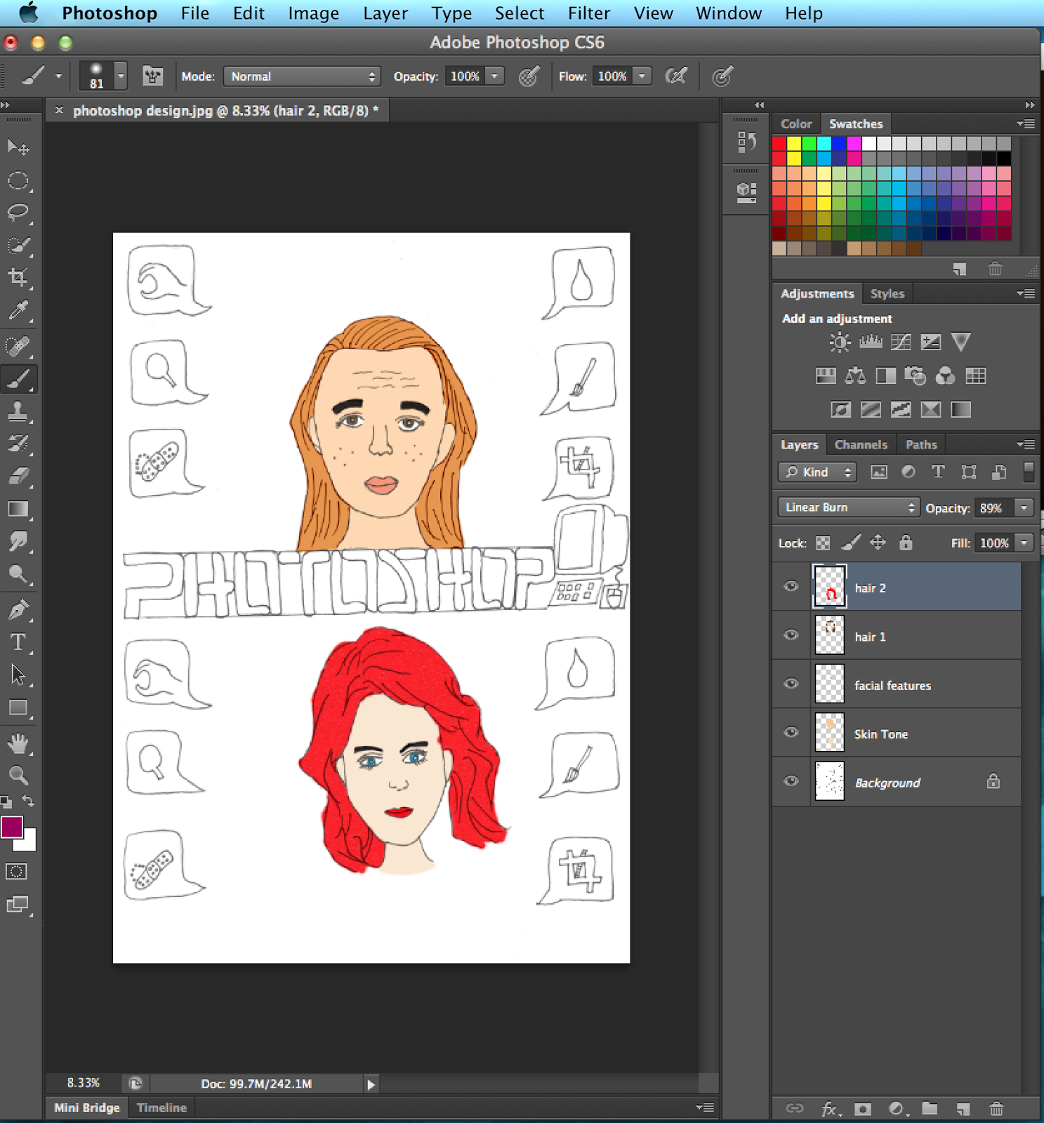
I then coloured their hair. For the bottom picture, after i coloured the girl's hair red, i further went and filtered it so that it would have a special effect.


Here, i then coloured the tools that were used in photoshop for retouching peoples skin or faces. I used a blur colour for the tools so that it would stand out. In this step, I also coloured the word Photoshop. I used the mezzotint filter for the the word.


Here, i coloured the computer and the background for the text. I used a bright pink colour so that the words photoshop would stand out against the light background. 


And lastly, after colouring my background, this is my final design project. For my background, i separated it into two layers. The first layer was black and the second layer was red. After colouring those two layers, I used an eraser with a special brush to create the strokes.


The reason why i came up with this idea was to show how technology has influenced and changed us humans. In the old days, you could not change how you look in a photo. Now however, with a digital camera we can instantly delete the photos we do not like and instantly retake another without having to worry about wasting expensive film. The same applies for photoshop, where we can edit and retouch our pictures to enhance our appearance. For example, we can change our hair colour, our eye colour or even make our face look thinner. Photoshop has and will continue to work wonders for us. However, no matter how much retouching or editing we do in photoshop, in reality, our appearances are still the same and we should always learn to love and accept ourselves irregardless of how we look.

Sketches for Final Design Project

We were asked to come up with five sketches to express how technology has influenced us humans. This is the first sketch i came up with.


For this sketch, i wanted to show how technology has advanced in agriculture. It shows a scene in a paddy field where farmers had to manually use a tool to collect their crops. However twenty years later, farmers have the technology to yield crops easily.


Here, i wanted to show how communication has evolved over the years because of the advancement of technology. In the old days, people had to use birds or horses to send a simple message. Now, with the creation of the telephone, calling a loved one would be just a click away.


For this sketch, i wanted to show that because of technology, our younger generation are becoming more and more antisocial. They slowly will lose their skills to communicate because they are too absorbed with playing their games.

Here, i wanted to show the evolution of transportation. In the old days, cars were not as efficient as some of the cars today. Besides that, transportation such as the airplane and boat have come a long long way.

And finally, this was my last sketch. In this sketch, i wanted to show the wonders of photoshop. These days, any photo you take can be edited or retouched. For example, if you have bad skin or different colored eyes, all of that can be changed through photoshop. This was also the sketch that had been approved for my final design project.

Pop Art


For this exercise, we had to turn one of our pictures into a pop art. i decided to use a yellow greenish colour for my face and neck so it would contrast with the dark colour of my background. For my hair, i coloured it red and decided to use a filter on it so that it would liven up the pop art.

Photo Montage


For this exercise, we were supposed to create a photo montage using photoshop. I chose a christmas theme for this photo montage because i really love the christmas season. I decided to look for a picture of an outdoor ice skating rink with a beautiful setting. After that, i found a picture of a couple ice skating happily, and put that onto the picture of the ice rink. On the top left hand corner, i inserted a picture of santa riding his sleigh with his reindeers! Besides that, i also found a picture of a snowman and the word Merry Christmas to put on the picture. I intentionally arranged the words near the snowman's hand so that it would like the snowman is holding the words up and wishing all of us a very Merry Christmas!!!

Friday, June 28, 2013

National Art Gallery Trip

During one of the weekends, our whole class took a trip to the National Art Gallery in Kuala Lumpur. There were a lot of paintings on exhibition there.


At the entrance, there were two escalators. On the wall next to the escalators, they showed some of the paintings that we were going to expect inside the art gallery.


The art gallery consisted of three floors and each floor had two separate sections, showcasing different artworks. Some artworks showcased there consisted both paintings and structure. Besides that, they also have regular art classes for children where they teach them how to draw and paint.


We were not allowed to take pictures inside the art gallery. However one painting that caught my eye was a watercolour painting by Long Thien Shih entitled Caged For Show. This particular painting had rows and rows of cages arranged side by side. These cages had birds inside of them and some of the cages had miscellaneous items inside them. I liked this painting because it had a very calming effect. The colours used were very bright colours such as a warm yellow tone to paint the cages and a clear blue sky with the occasional clouds. The cages were also painted in a way that the further the cages were in the painting, the smaller they would get. I also liked these painting very much because it gives a feeling of a warm, sunny, windy day where we can just stand and admire the birds that are "caged for show".


Design and Pattern


For this exercise, we were asked to create a pattern using the principles and elements of design. I drew this pattern because i liked tribal designs. A principle of design implemented in this pattern is repetition. The tribal patterns are drawn repetitively where the design constantly alternated between the right and left triangle and the top and bottom triangle pattern. Besides that, an element of design used in this pattern is shapes. For example, triangles were mostly used to from the tribal pattern.

Sunday, June 16, 2013

Art Movement

Impressionism


One artwork i like from the Impressionist period is this painting titled: Saint Lazare Train Station by Claude Monet. Impressionism is a nineteenth century art movement that was started by artists based in paris ( Wikipedia, 2013). Some notable artists of the impressionism period include Claude Monet, Frederic Bazille and Paul Sezanne. Some main characteristics of Impressionism are relatively small, yet visible brush strokes (Wikipedia, 2013). Besides that, impressionism characteristics also included the use of movement and unusual visual angles. Impressionists usually painted landscapes, outdoors or portraits. Rather than concentrating on small details, they concentrated on the overall outlook of the painting using short "broken" brush strokes using mixed and pure unmixed colour to intensify colour vibration ( Wikipedia, 2013). I chose this artwork because of its simplicity in showing the atmosphere at a train station. Just by utilizing short "broken" brush strokes, Monet was able to bring to life the atmosphere at a train station. 

Sunday, June 9, 2013

Picture With A Story


Escape. Something he had been dreaming of his whole life. Everyday, he would sit by the fence for hours, dreaming about the day that he would be free. Life had never been easy for him the moment he was born. When he was about five years old, he learnt that his mother had passed away when she gave birth to him. A few years later, his father was involved in a fatal car accident which killed him on the spot. Following that incident, his luck got worse as he was sent to foster parents who mistreated him. Rather than treat him like a son, they treated him like a servant, making him do menial chores such as washing clothes, washing the dishes, cleaning the house and among other heavy chores. All these chores for an eight year old! Everyday, he would have the same routine where he had to perform all his chores. If not, he would receive beatings from his foster parents or sometimes they would go to the extent of starving him. Every moment, he would sit down by the fence, thinking how his life would be if his parents were still alive. Would he be suffering like this? Would he be happy? All the endless possibilities. But one word has always been replaying in his mind ever since he arrived here. Escape. One day, he knows that he will escape and be free of this suffering.

Monday, June 3, 2013

My Favourite Colour


Source : Google Images

One of my favourite colours is blue. Many things in life are the colour of blue such as the sky and the deep sea and even gemstones. On the optical spectrum, blue is located in between violet and green. There are many shades of blue ranging from dark blue to light blue. There are even beautiful shades of blue mixed with green that create the colour turquoise and aquamarine. Blue is one of my favourite colours because it has a calming effect and reminds me of days where we can relax by the beach staring at the blue sea and cloudless sky.Blue promotes the feeling of tranquility and quiteness, encouraging physical and mental relaxation ( The Colour Blue, n.d.).Blue represents a lot of things from a psychological perspective. For instance, blue can represent authority: a darker shade of blue would represent more authority ( The COlor Blue, n.d.). Blue also can mean peace and calm and it can induce the feeling of calmness within us  by reminding us of peaceful still waters in a lake or the rhythm of water running through a stream. Blue is often used whenever we want to induce an environment of calmness and peace. The colour blue has a very therapeutic feeling.On top of that, the colour blue is also often associated with honesty and loyalty. 

Sunday, June 2, 2013

The principles and elements of design

Principles of Design

The first principle of design is balance. It is important to have balance in your design as it gives stability and structure to your overall design. Balance is decided by how we place our elements in our design. For example, a big circle in the middle could be balanced by placing two small circles at the side.

The second principle of design is proximity. Proximity is defined by the dictionary as the nearness in space or time. Proximity helps to create a relationship between the elements in a design. It serves as a focal point, such that the elements need not be placed beside each other, but would still be visually connected.


The third principle of design is alignment. Alignment helps us to create a visual connection between the elements in a design. It helps to give order and organisation in our design so that our design would appear neat and not cluttered. Alignment can also serve as a guide as to where to place our next element.

The fourth principle of design is repetition. Repetition is where individual elements are repeated again and again in a design. This repeated order helps to create association between the elements and gives the design a sense of grouping between the elements.

The fifth principle of design is contrast. Contrast can be defined as the total opposite of a an object. For instance black is the opposite of white. This shows the contrast between colours. Another example of contrast between direction is , horizontal is the opposite of vertical.

Elements of Design

The first element of design is shape. Shape is defined by the dictionary as the characteristic surface configuration of a thing ; an outline or contour. Examples of shapes are circles, squares and rectangles.

The second element of design is line. Lines can be used to create various shapes and this happens when both ends of the line join to meet each other . Lines are very useful in designing as lines can show movements and a line can be curved or straight.

The third element of design is direction. All lines must have a direction. For example, Lines can horizontal or vertical. Direction can also determine movement by which the speed at which it is changed.

The fourth element of design is tone. Tone in a design shows us the lightness or darkness. Tone allows us to give solidity, weight and volume to our design. For example, a yellow tone is light whereas a blue tone is dark.

The fifth element is texture. Texture is related to how a surface feels, whether it is rough, smooth, regular or irregular. 

Saturday, June 1, 2013

Abstract Design


We were asked to create an abstract design using photoshop. To create this abstract, i experimented with the tools and layers. I used the elliptical marquee tool to create the circle shapes and then filled them in with different colours. I then used a brush tool to form the strokes surrounding the circle. For the background, i created a few different layers. I used the gradient effect for the first layer which transited from black to white. The second layer was where i had drawn my circles. For the third layer, i used a rainbow gradient and later i used the eraser tool to erase some parts so that the layers beneath containing the circles, could be seen.